My aim
This article is the explanation of my logic behind opening leveraged short positions on several US stocks. Whatever I write about, however right or wrong, I support by putting my capital on it.
I am publishing this to achieve two objectives:
- To receive feedback that will help me to time the recession even better, or that will convince me that I am wrong, and I won’t lose money
- To find partners with whom we can run a fund so that we can bounce our ideas off each other. My vision is to find boom/bust sequences in the economies of different countries and their sub-sectors
I am going to lay down my logic in three articles:
- Timing a recession
- Selecting the most vulnerable industries and stocks to short them
- Timing the rock bottom, the perfect time to go long
Note that I may be wrong and the history shows I’m wrong much more often than I’m right.
How I think the recession works
Recessions are driven by debt cycles. As the cycle starts, companies take debts to improve their performance, and people take debts to finance spending. At first, the debt grows in line with productivity, but eventually, debts start to grow faster, because of a) the investment inefficiency, b) “wealth effect”.
When you take a debt of $100, the person who issued it owns a debt obligation of $100. As soon as you pay him the service payments, he feels rich. Whenever you spend the lent money, someone gets them. Let’s say, you used the $100 to renovate your rental property. Several things happened: the property increased in value, your cash flow has risen, the workers got paid. You and the workers also feel richer now. The workers spend $100 to purchase products, and someone’s earnings grow.
When earnings grow, someone’s financial books get better and someone’s net worth grows. Whenever the net worths grow, people can take on more debts or just feel richer. They spend more, and someone’s earnings rise once again. The cycle repeats itself but is inherently unsustainable.
At one point, the person who has got the riskiest possible debt delayed the service payment for a day. This is the breakpoint, which can be triggered by an outside force as well as by an internal fluctuation.
The lender starts to worry, feels a little bit more alert and a little bit less wealthy. He rolls over fewer debts, leaving the riskiest debtors out. The fewer debts are being issued, the less wealthy the debtors feel. They start to cut spendings. As soon as one person’s spending is another person’s earning and another’s person’s net worth, the earnings and net worths fall.
The reverse process starts to feed on itself, and the economy contracts. This is well-described by Ray Dalio and I just re-use his logic.
How to time the economy
Here, I will explain what are my proxies (indicators) to measure the state of the economy, what is the theory how they work and correspond to the state of the economy, and will show how I tested them. Then, I will apply them to the current state of the economy to measure how close we are to the peak. In the last section of this article I will disclose their drawbacks and limitations (yes, they can misfire).
Indicators explained
I have found three groups of indicators that I think are good proxies for what is happening with the economy. The three groups are the indicators that reflect: lender appetites, consumer sentiment, and manufacturing output.
Lender appetites
Consumer sentiment

Manufacturing

Let’s review them one by one. Applying the model of how the recession works, I can make the following assumptions:
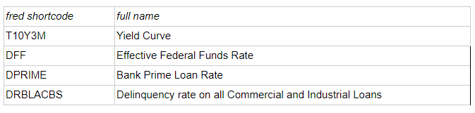
Yield Curve indicator (rates on treasuries 10Y minus rates on treasuries 3M) indicates the difference in LT — ST rates. Whenever it inverts (becomes negative), it means that there is a short-term cash squeeze, people see keeping cash as much more preferable than giving debt. As the market is a two-way street, it also means that the debtors need debts so much that they are willing to pay a premium.
In my opinion, the yield curve inversion once happened for a couple of weeks, signals an irreversible process, that the debt cycle reverted and the contraction has started, even if the inversion subsides. The economy still moves upward for some time, driven by interest rate cuts, or injected liquidity to finance ST debts, etc. However, I can defend this opinion only empirically — which I will do in the next sections.
Effective Federal Funds Rate — in my theory, the Fed, whenever he senses the economy overheating (i.e. that the growth is financed increasingly by debt), starts to increase the IR. Therefore, what can be the reason for stopping rate increases, and starting to cut the rates, except for the danger of the economic contraction? Empirically, I can see that the CB cuts rates 2–3 months before the market peak (seemingly it is exactly what creates the last market surge). As soon as the economy has already started to contract, the rate cuts can only do a short-term effect, but can not reverse its move. Then, after the big market crash, the CB cuts the rates drastically, to provide markets with capital pipelines so that the recession won’t lead to ruining important systemic institutions, which can lead to a depression.
Bank Prime Loan Rate — moves in line with the CB rate, reflects how expensive is the lending for the end customer.
Delinquency rate on all Commercial and Industrial Loans — the rise of delinquency is perfect proof that the contraction phase has started. Some of the service payments start to be delayed, and it gets a statistical reflection. The deadly drawback of this indicator is that it fires when it is too late: it is a lagging indicator that is published after 60–70 days after the quarter end. So if you see it jumping, you missed the market peak; time to double the short positions.
Unemployment Rate, Seasonally Adjusted — everyone can not be effectively employed, unless there’s an excess capital and if you don’t spend it — you lose money. If everyone has got a job, that means you don’t fire inefficient people — bottom 10%, or bottom 1%. There’s no competition in the talent market between the talents. The falling unemployment rate can not sustain for long. It is a sign of excess availability of capital and abnormal growth. Empirically, you can see that this trend eventually reverses: first, you can see the lay-offs jump (Unemployment Level: Job Losers on Layoff), what makes sense: lay-offs are easier to do than firing the inefficient employees. Then, the firings catch-up, as you can see on the Unemployment Level: Job Losers Not on Layoff indicator. What is important is to watch both seasonally adjusted and unadjusted versions. If 20% more people lost job this month than the previous month, it is bad for the economy and can trigger the reversal, even though this number can be in line with the previous year’s number (i.e. if the YOY unemployment didn’t rise, but absolute level has risen, it’s bad for the economy). Remember, one person’s spending is another person’s earning and net worth.
Continued Claims (Insured Unemployment) — the best advantage of this indicator is that it’s being updated weekly, so if there’s a huge jump in unemployment, you don’t have to wait until 5–6th day of the next month when the monthly unemployment stats are usually issued. The drawback is that not every employee is insured against job loss so not everyone will be included.
Value of Manufacturers’ New Orders for Consumer Goods: Consumer Durable Goods Industries, Million of Dollars, Seasonally Adjusted (ACDGNO) — spending cuts is both the reason and the consequence of the economic contraction. Value of new orders is a good proxy for spending cuts — manufacturing is an industry very sensitive to consumer earnings. If this indicator falls, it means that this industry doesn’t expect expansion, and thus expects contraction. This is a self-fulfilling prophecy because someone’s spending is another company’s earnings.
Manufacturing Sector: Real Output — same logic as with the previous indicator, but the drawback is that it’s delayed 70 days after the end of the quarter. If you see this indicator sinking, it confirms that we passed the peak a long time ago (however, it can misfire, as manufacturing has got its own cycles — see later sections).
Indicators’ historical performance
Significant dates
Here are the significant dates of the market performance. I took 5 market indices and explored to see what were the market peaks and rock bottoms of the three last recessions. Based on this information, we will explore the indicator performance before each of those recessions.
It turned out that different indices peaked at different times:
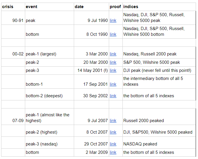
Let’s look at each recession closely.
1. T10Y3M
This had significant prolongated periods of inversion (-0.10 or higher, for 4 weeks or more) before each of the last 3 recessions (I studied only the last three, but this article suggests “last four recessions”).
However, the timing is not always correct: e.g. in 2000, NASDAQ peaked a couple of months earlier than the yield curve started to invert. However, DJI peaked after the inversion subsided, long after NASDAQ has sunk. Perhaps it’s because NASDAQ reflected the very bubble that pricked — tech companies, and DJI reflected the economy in more general terms.
In any case, I draw a conclusion that whenever you see a prolonged and significant yield curve inversion, the market crash is inevitable. In the past, the market peak could have between -2 and +14 months from that moment, depending on the index you use as a proxy for “the market”.
2. DFF/DPRIME
You can see that the Fed Funds Rate starts to flatten close to the market peak. Whenever the CB starts to cut rates a bit, in face of the yield curve inversion, it’s either the peak, or it’s too late.
Recession 1990:
Gradual cuts started during the yc inversion, in 4 months before the market peak (link)
Recession 2000:
This “top” period had two waves of cuts: first one, started in October 1998 after a small (not “significant prolonged”) yc inversion, and followed by NASDAQ peak in March 2000 (14 months). Then the rates went up, and another wave of cuts started in Jan 2001, followed by a DJI peak in May 2001 (in 4 months) (link).
In 2000, the situation is complex and I didn’t crack it yet: it seems there were two bubbles: tech and the whole economy. CB started to ease in September 1998, maybe in response to the inverted yc. Then the tech bubble popped up, while CB was tightening. The bubble pricked in March 2000, the CB kept tightening (it seems like they didn’t feel the economy is contracting). Then the CB started to ease in Jan 2001, and the DJI peaked soon (May 2001), dropping to a local bottom in September 2001, and then dropping even more to the whole market’s rock bottom in September 2002.
Recession 2007:
The cuts started in September 2007 (after a significant yc inversion in Q4 2006) and the market peaked in October 2007 (in 1 month) (link).
I draw a general conclusion that whenever CB starts easing during or after the yc inversion, this is another sign of the coming recession, and the CB recognizes it.
3. Unemployment
We are getting more and more precise. As previously explained, everyone can not be employed, the economy needs to fire worst performing people and close down worst performing organizations to work efficiently. The unemployment peaks during the recession, and gradually falls until it plateaues. Whenever the trend reverses, the market peak has reached or is very close.
The 1990 recession:
The insured job loss claims pick up from November 1988.
The layoffs pick up from February 1989.
The firings pick up from May 1989.
July 1990 (in 14 months) — the market peak (all 5 indices peaked).
Here we can see that this indicator has been a good recession predictor.
The 2000 recession:
The unemployment indicators didn’t predict the tech bubble peak. And they shouldn’t have predicted it. The tech bubble was not as much debt-driven phenomena as it was a bias in valuation that created a self-reinforcing trend. The tech bubble pricking was not related to the unemployment leading to less spendings. Just the bias became too pronounced and it reversed.
First, the NASDAQ peaked in March 2000 (as well as Russell 2000, S&P, Wilshire 5000). Layoffs and insured claims picked up within weeks. In June 2000, firings picked up as well. In May 2001 (in 10 months) the DJI peaked.
Here we can see that this indicator can be lagging.
The 2007 recession:
May 2006 — insured claims pick up
October 2006 — firings pick up
February 2007 — layoffs pick up
October 2007 (in 8 months) — markets peak
Summary
So after reviewing the behaviour of the unemployment indicators, I can conclude that the market peak usually happens within 0 to 14 months after each of these indicators pick up.
Percent Change from Year Ago
It’s beneficial to look at the Percent Change From Year Ago.
4. Manufacturing
Let’s check how Value of Manufacturers’ New Orders for Consumer Goods: Consumer Durable Goods Industries, Million of Dollars, Seasonally Adjusted (ACDGNO) behaves prior to a recession.
Percent Change from Year Ago:
In general, it falls shortly before or after the recession. The growth peaks shortly before the economy peak (0–12 months). This indicator is not very useful as a leading indicator, because it triggers at the peak, but it is useful to confirm or disconfirm one’s hypotheses about a recession.
In 2000, it could have helped to weather the NASDAQ peak, which doesn’t make much sense as it should not be very correlated with tech stocks.
5. Lagging indicators
These indicators don’t do the job of predicting the market peak but can help you to tell if you have just passed one. They are like rear-view mirrors.
Manufacturing Sector Real Output
Percent Change from Year Ago:
It stops growing and falls during a recession. If you see the Percent Change from Year Ago falling, after you saw an inverted curve, you can say with some confidence you’re within a recession.
Delinquency Rate on all Commercial and Industrial Loans
At the market peak, debt service payments get delayed, and some debts get defaulted on. This is exactly what this indicator shows, but its drawback is that it is being issued quarterly and delayed for 60–70 days after the quarter’s end. It means that the markets may go from the peak to the bottom and this indicator will remain silent.
On the image above, you can see that it picks up shortly before the market peak (and even could have helped to predict 2000’s NASDAQ peak), but the reports usually come too late (red vertical lines) to be useful to predict the market peak. Nevertheless, if you see this indicator’s Percent Change from Year Ago jumping over 10%, it means that the market peak is 0–12 months ahead, what, after the correction for a delay, is -6 to +6 months ahead.
Percent Change from Year Ago:
Consumer Sentiment (bonus)
This would be a useful indicator if it would survey CEOs of debt-taking companies. Since it’s a wide statistical survey, it reflects the economy in general, not its risky top. It falls down in between -1 to 1 months of the market peak (if we exclude the tech bubble’s peak in 2000s).
Risks and Limitations
There’s a couple of limitations that I realize:
- The most precise indicator, Effective Federal Funds Rate, can only predict the recession within 1 to 4 months. So the worst performance is 4 months. If one had entered 4 months before the peak in 2007, the market would still go up 25%. If the leverage of a short position would be 1:4, then one’s capital would be eaten out completely.
- History never repeats itself
- The “trade deal” / “trade war” with China are quite an unpredictable events
- It is unclear how Trump impeachment can impact the economy
- This data is available to many participants and it can be already embedded in the market prices
The predictive precision of indicators

The current situation as I see it
30 Dec 2019:
1. There was a “significant and long” yield curve inversion from late May to mid October 2019 (Yield Curve indicator triggered)
2. The Fed senses the slowdown, cuts rates a bit, but leaves space for maneuver in case of a severe liquidity crisis (DFF/DPRIME triggered).
3. Layoffs, Firings and Insurance Claims seem to pick up (Unemployment seems triggered), but let’s wait for the new data that comes by January 5th — 7th.
4. Value of Manufacturing new orders on durable goods — seems to be triggered but let’s wait for the new data coming at January, 5th — 7th.
5. In 2019 Q3, the Delinquency on Commercial and Industrial Loans picked up, and the Manufacturing Real Output had dropped. The Q4 data will be available in 2020 Feb-Mar, but it might be too late. Two lagging indicators were triggered.
6. Consumers still seem confident. This doesn’t mean that the peak is not now though.
My thinking is that the Fed Cuts stimulated the last jump of the economy, but there isn’t a room for one more. All the indicators, even the lagging indicators have triggered.
After receiving the Unemployment data and Value of Manufacturing new orders on durable goods on January 5th — 7th, I am going to open a non-leveraged short position on the market indices and particular stocks, with a 10% stop-loss.
I will review my positions and indicators in a couple of weeks and double down if they remain triggered, even if the Fed cuts the rates further.
Summary
Feel free to ask questions and let’s have an open-minded discussion
- in the comments below
- by email (nichiporets@gmail.com)
- or over a cup of coffee in NYC
Resources
- FRED Dashboard with all the graphs
https://research.stlouisfed.org/dashboard/45198